Aivora — AI Automation SaaS Website Design
Industry
SaaS
Headquarters
United States
Services
Website Design
SaaS Website
Visual Design
UX Research
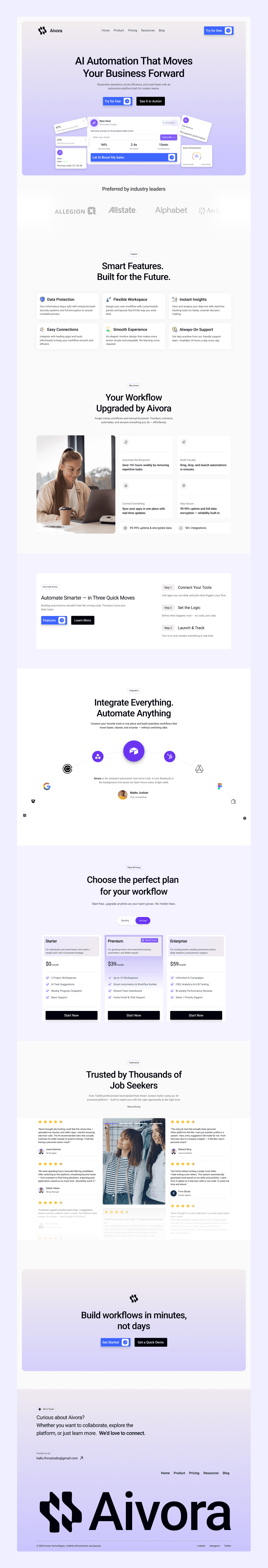
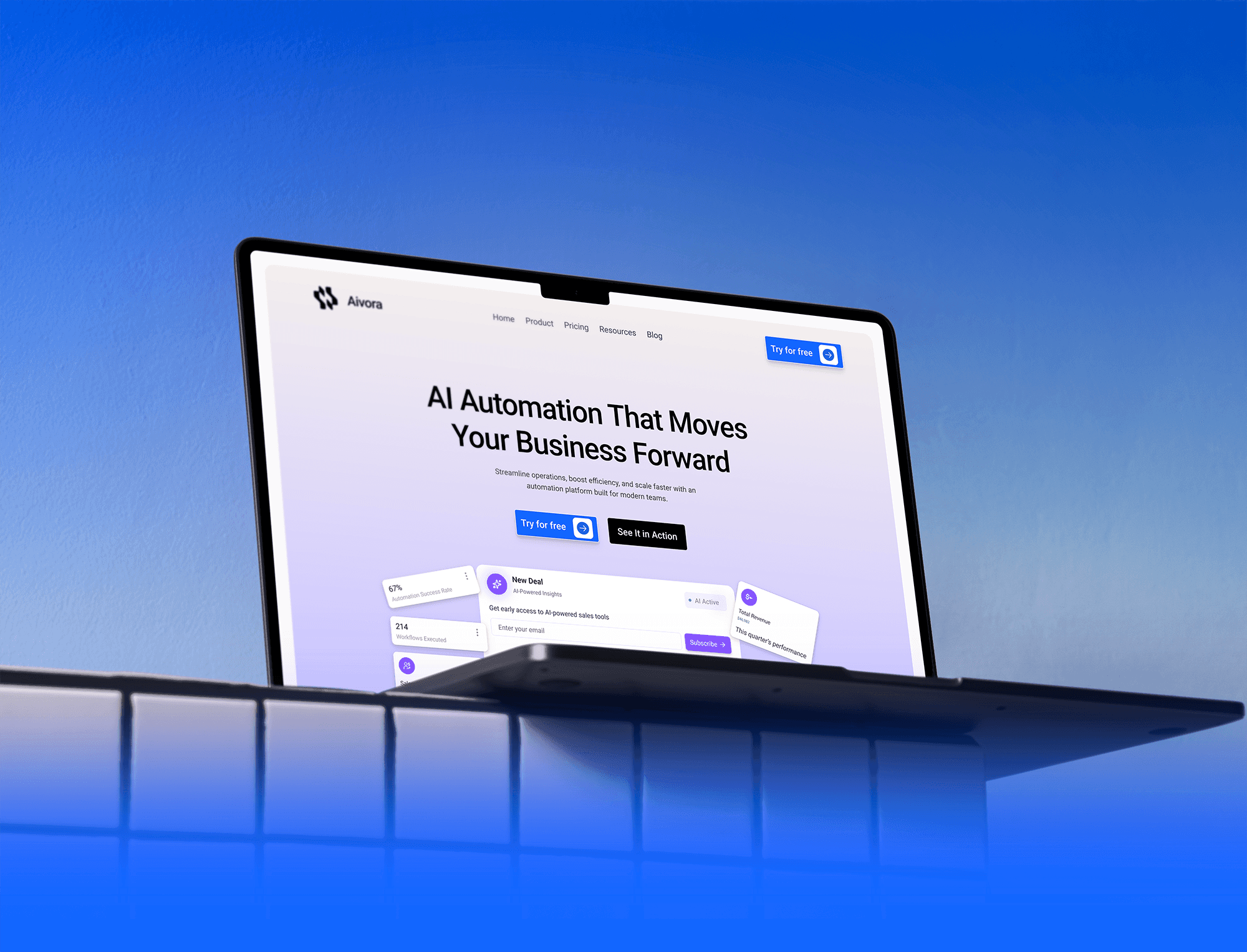
Preview
About Project
Aivora is a modern AI automation SaaS platform designed to help businesses streamline workflows, reduce repetitive tasks, and scale operations efficiently. The platform focuses on speed, clarity, and intelligent automation to improve productivity across teams.
The goal was to design a clean, conversion-focused website that communicates innovation, credibility, and ease of use.
The experience balances futuristic visuals with structured layouts—making complex automation feel simple, powerful, and accessible for growing businesses.
The Problem
Many businesses struggle with repetitive tasks, disconnected tools, and inefficient workflows. Existing systems often require manual effort, switching between multiple platforms, and lack real-time visibility.
Users found automation tools complex, overwhelming, and difficult to configure. The interface lacked clarity, making it hard to understand features, benefits, and real value. As a result, trust and adoption were lower than expected.
Key issues that hurt the business
— Complex onboarding and unclear feature explanation
— Overwhelming dashboards and poor information hierarchy
— Weak communication of automation benefits
— Confusing pricing and plan comparison
— Lack of strong visual trust and credibility signals
The Solution
We redesigned the Aivora website with a strong focus on clarity, simplicity, and conversion. The new experience communicates automation in a structured and approachable way—making advanced technology feel easy and actionable.
Clean layouts, bold headlines, and clear feature breakdowns guide users naturally from discovery to decision. The design balances futuristic aesthetics with usability—building confidence and driving engagement.
What we delivered
— Clear value-driven hero section
— Structured feature and workflow explanation
— Conversion-focused pricing layout
— Strong visual hierarchy and trust cues
— Fully responsive, modern UI system

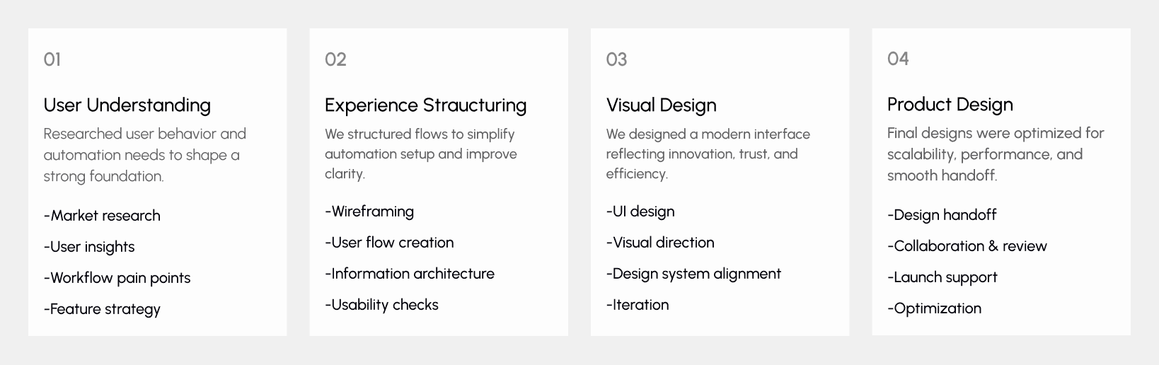
Design Process
Our design process followed a Lean UX approach focused on clarity, performance, and conversion. Each decision was aligned with user workflows, automation goals, and business growth objectives.
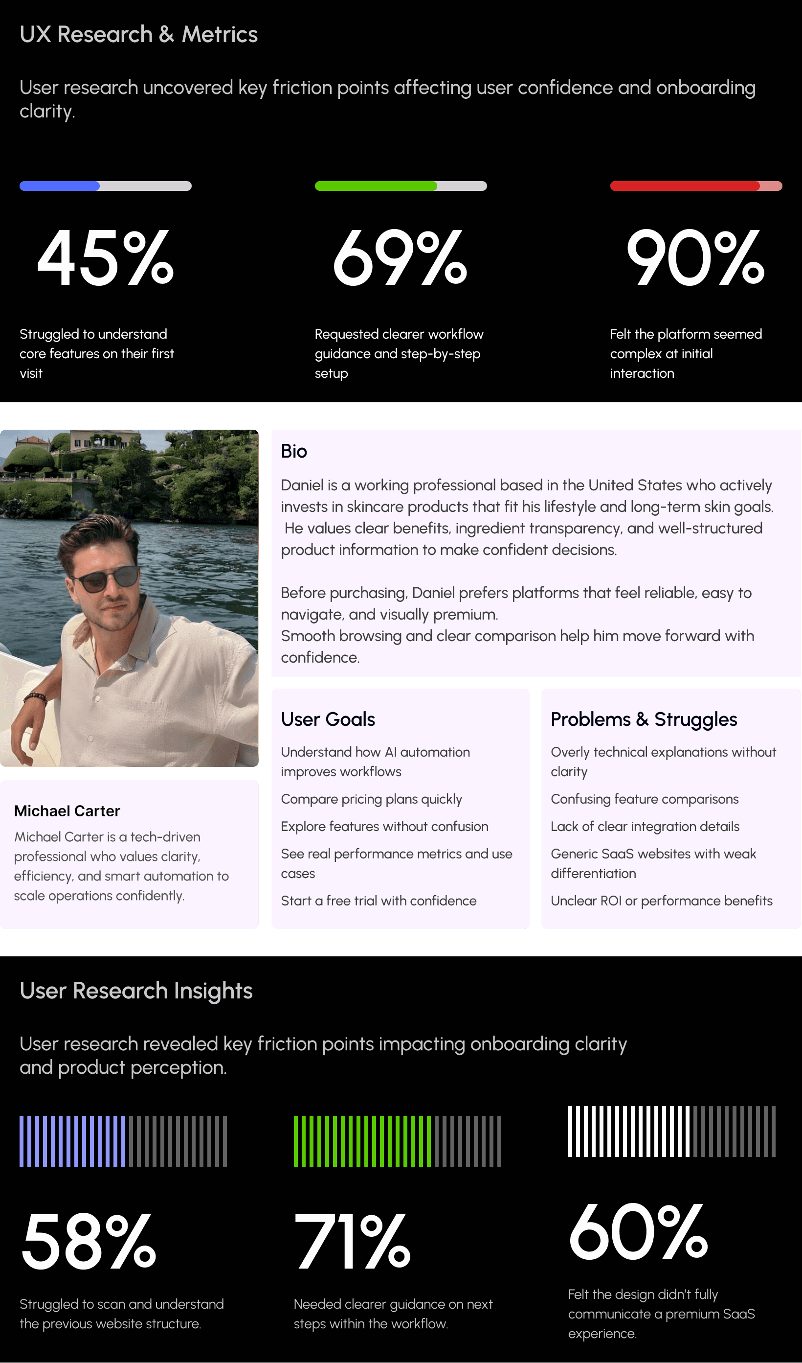
UX Research & Insights
Understanding real user behavior was central to designing the automation platform.
We studied how SaaS users explore tools, set up workflows, and evaluate automation value before committing.
The goal was to uncover friction points and transform them into opportunities for clarity, efficiency, and trust.
Our research revealed that users prioritize simple onboarding, clear feature explanations, transparent pricing, and visible performance benefits early in their journey.
Based on these insights, we refined core workflows to reduce setup complexity and create a faster, more intuitive automation experience across devices.
Key Research Findings
Users felt overwhelmed by complex automation dashboards on first visit
Many struggled to understand workflow setup without guided steps
Feature benefits were not clearly communicated upfront
Mobile usability lacked clarity in multi-step processes
Trust signals and performance metrics needed stronger visibility
Visual Identity & Brand Story
The visual identity of Aivora was designed to feel modern, intelligent, and trustworthy.
Clean typography, balanced spacing, and a bold tech-inspired color palette reinforce its innovative SaaS positioning.
Each screen was crafted to feel structured, intuitive, and performance-driven—reflecting speed, automation, and clarity.
The result is a cohesive visual language that works seamlessly across desktop and mobile, strengthening credibility at every interaction.

Design system
We created a scalable and consistent design system tailored for a modern AI automation SaaS platform.
A bold tech-driven color palette, clean typography, and structured layouts establish clarity, innovation, and trust.
Structured grids, spacing rules, and reusable UI components were applied across dashboards, pricing sections, feature blocks, and CTAs—supporting usability, performance, and long-term product scalability.

UI Design
The UI design focuses on creating a clean, modern, and conversion-driven SaaS experience that reflects innovation and trust.
Strong visual hierarchy highlights automation features, product benefits, integrations, pricing plans, and clear call-to-action buttons.
A bold yet balanced color palette, consistent typography, and structured layouts reduce complexity and improve clarity.
Interactive components, data visuals, and clear workflow sections guide users smoothly from exploration to action.
The interface remains fully responsive across devices, ensuring a seamless, fast, and intuitive experience for modern SaaS users.