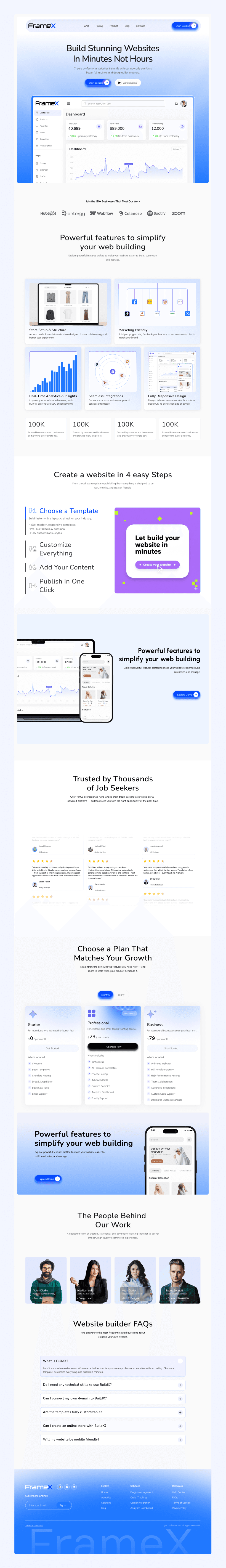
FrameX Tach — SaaS Website Builder Landing Page Design

Industry
SAAS
Headquarters
United States
Services
Website Design
B2B Business
Visual Design
UX Research
Preview
About Project
FrameXTech is a SaaS-driven digital agency that provides modern website solutions for businesses, startups, and enterprises. The platform allows users to explore live website demos, understand services clearly, and choose the right solution with confidence. By combining thoughtful UX design with scalable systems, FrameXTech ensures every interaction feels simple, transparent, and results-driven.
The goal was to design a clean, scalable, and professional digital experience that showcases services, builds trust, and helps clients quickly understand how FrameXTech can support their digital growth.
The Problem
Although FrameXTech offers strong digital services, the previous experience did not clearly communicate value or guide users effectively.
Service offerings felt scattered, and users often struggled to understand how the team could help them achieve their goals.
Key issues that hurt the business
— Service offerings were unclear and difficult to understand
— Lack of clear user flow reduced trust and confidence
— Weak visual hierarchy made information hard to scan
— Call-to-actions were not prominent or actionable
— The experience did not reflect a scalable SaaS agency
The Solution
We redesigned the platform with a strong focus on clarity, usability, and conversion. The new experience presents services in a structured and easy-to-understand way, guides users smoothly through demos and workflows, and uses a clean, consistent visual system to build trust and encourage confident action.
What we delivered
— Clear, service-focused layouts
— Live website demos for better understanding
— Strong, action-driven CTAs
— Fully responsive, scalable design
— Consistent visual system to build trust
Design Process
Our design process follows a Lean UX approach focused on clarity, speed, and scalability. Each phase is carefully structured to align user needs with business goals, ensuring every design decision is purposeful, efficient, and ready for real-world use.
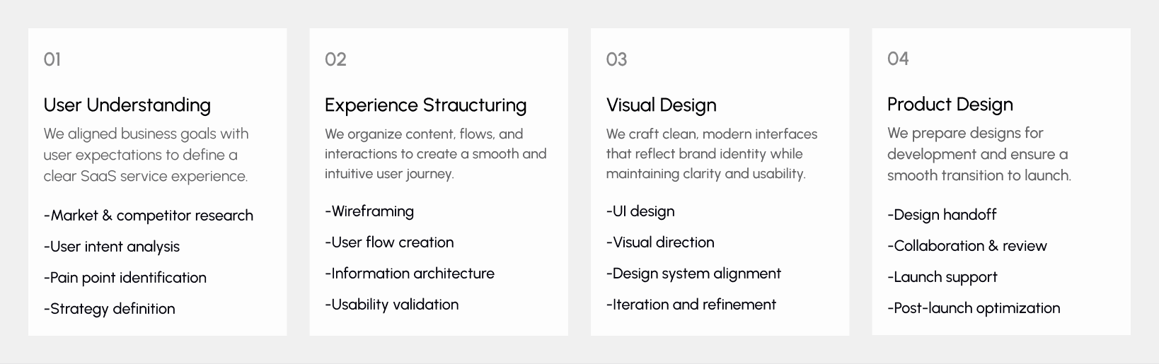
UX Research & Insights
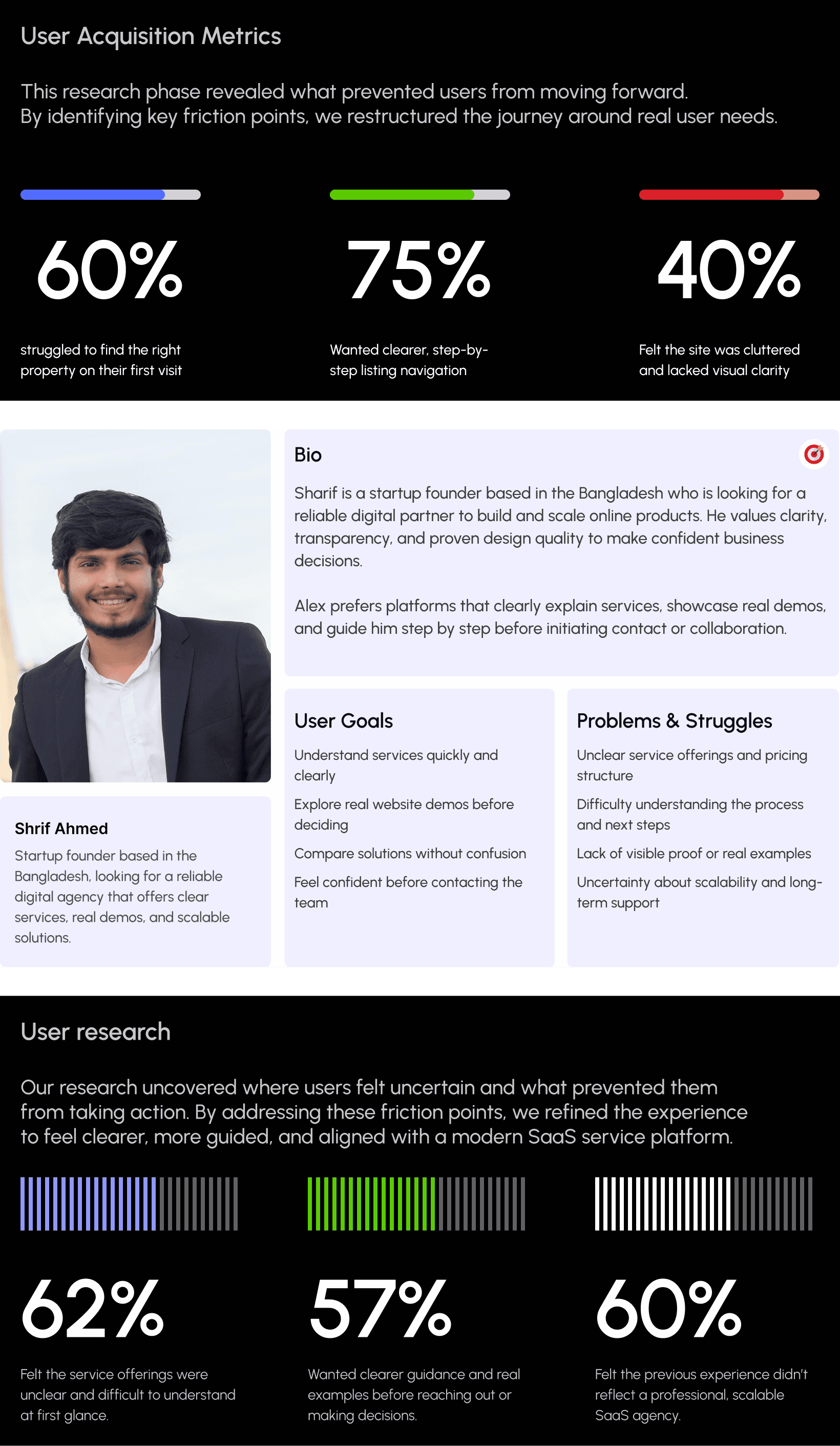
Understanding real user behavior was a core part of this project. We conducted in-depth research to observe how users explore services, evaluate offerings, and decide when to take action. The goal was to identify friction points and transform them into opportunities for clarity, trust, and confident decision-making.
Our research revealed that users expect clear service explanations, visible proof of work, and a guided journey before reaching out. Based on these insights, we refined key user flows, improved content structure, and reduced cognitive load to create a smoother, more SaaS-focused experience across all devices.
Key Research Findings
Users struggled to understand services at first glance
Many users felt unsure about the next step in the journey
Lack of clear demos reduced confidence before contact
Mobile users faced readability and navigation challenges
Users preferred a guided, step-by-step experience
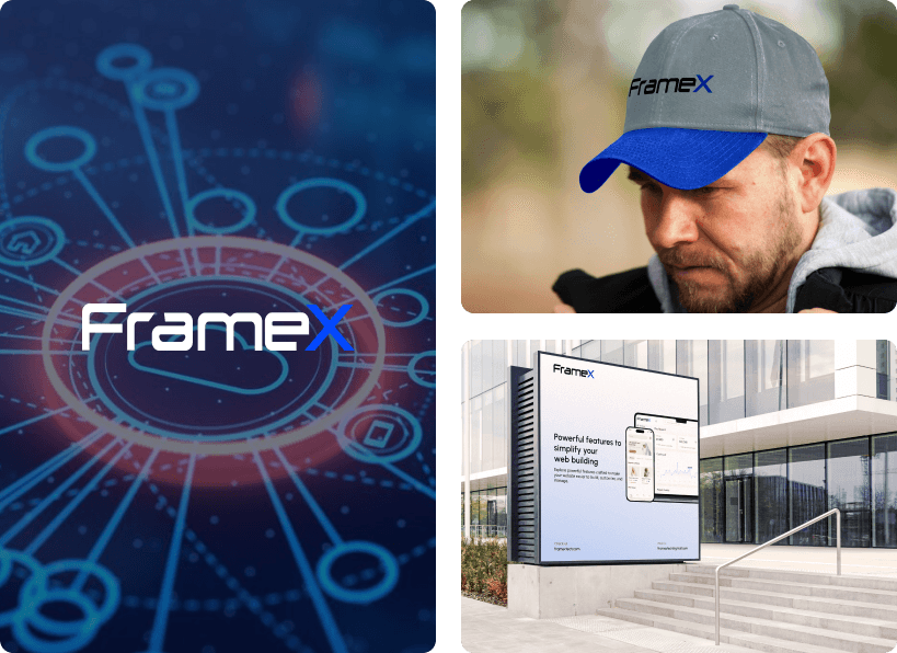
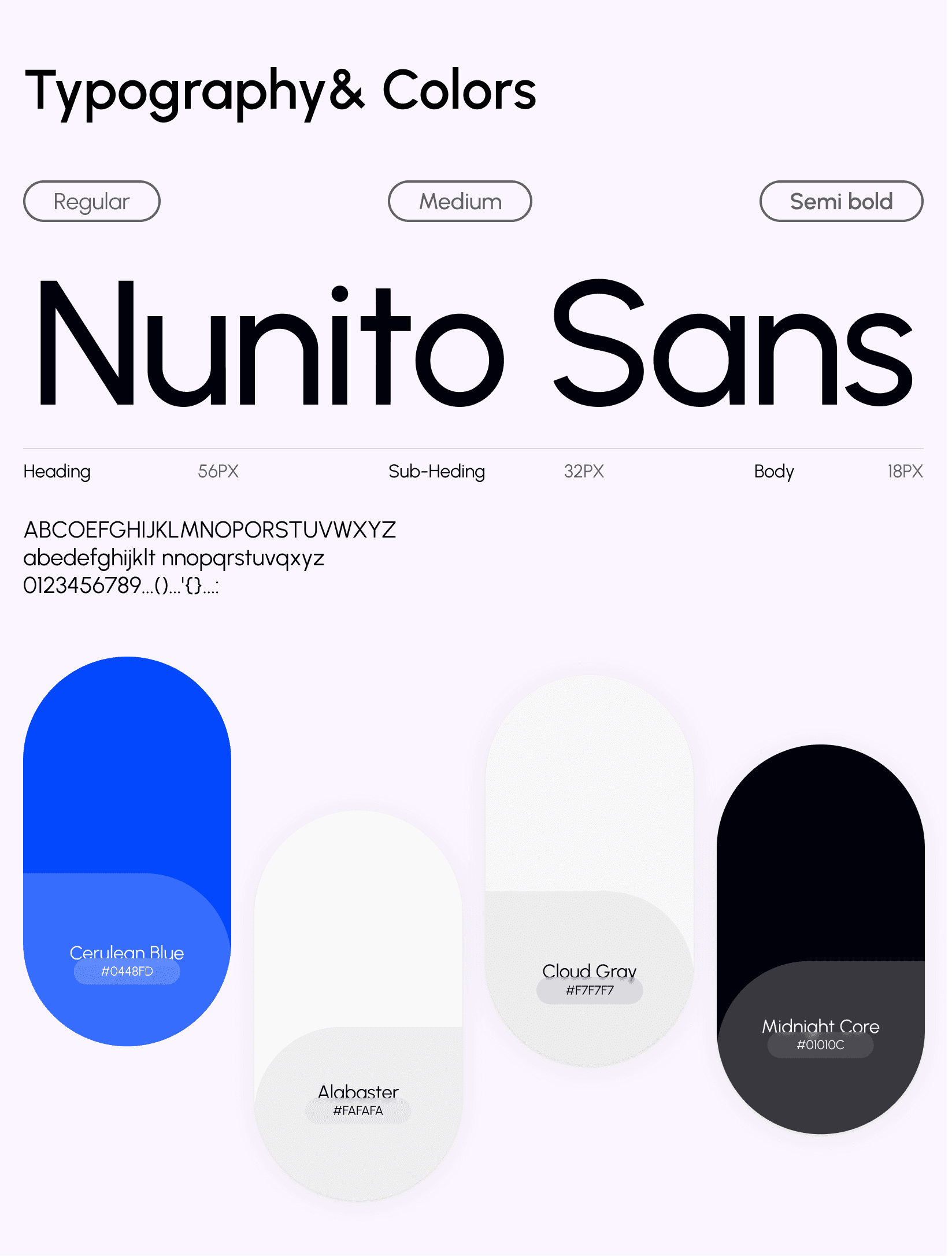
Visual Identity & Brand Story
The visual identity was designed to feel modern, confident, and scalable—reflecting FrameXTech’s SaaS-driven and product-focused approach. Clean typography, balanced spacing, and a minimal color system were used to create a clear, professional experience that feels trustworthy and easy to navigate.
Every screen was crafted to communicate clarity and purpose, helping users understand services quickly while maintaining a consistent, polished look across both desktop and mobile platforms.
Design system
We created a scalable and consistent design system for a modern real estate platform, focused on clarity, speed, and trust.
A neutral color palette with subtle accents and clean typography was used to establish strong hierarchy, readability, and a premium brand feel.
Structured grid logic, spacing rules, and reusable UI components were applied across cards, filters, forms, and CT's.
Every element was designed to support usability, performance, and long-term scalability allowing the product to grow while staying easy to maintain.
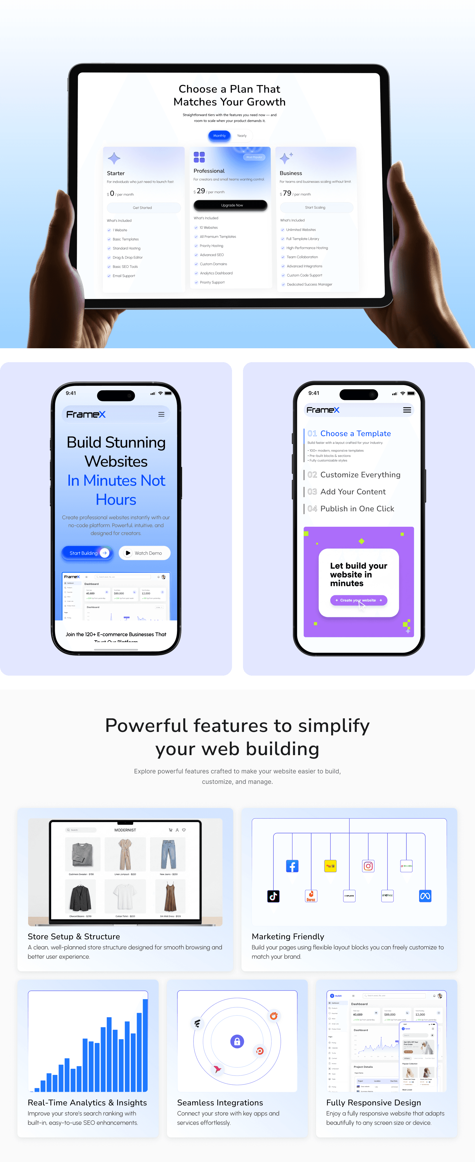
UI Design
The UI design was crafted to deliver a clean, modern, and visually balanced experience that clearly communicates FrameXTech’s services and value. Strong visual hierarchy guides users’ attention to key elements such as service offerings, live demos, feature highlights, and call-to-action buttons—helping users understand the platform quickly and take confident action.
A minimal yet expressive color palette, consistent typography, and spacious layouts were used to reduce visual noise and improve overall readability. Each section is thoughtfully structured to maintain clarity while supporting exploration, comparison, and decision-making without overwhelming the user.
The interface remains consistent across desktop, tablet, and mobile devices, ensuring a smooth and familiar experience on every screen. Every interaction and layout decision was designed with usability and conversion in mind—creating an interface that feels intuitive, refined, and aligned with both user needs and business goals.