Demolite — Construction / Demolition Industry Website Design
Industry
Construction
Headquarters
United States
Services
Website Design
Construction Website
Visual Design
UX Research
Preview
About Project
DemoLite is a conceptual web project created to showcase modern UI/UX design and clean web structure. It focuses on clarity, responsiveness, and strong visual hierarchy to demonstrate how a user-friendly, scalable website can be built.
The project highlights practical design thinking, usability, and modern aesthetics—turning ideas into intuitive digital experiences. Each section is carefully structured to reflect real-world business needs, including clear navigation, engaging layouts, and conversion-focused elements. DemoLite also emphasizes performance, accessibility, and consistency across devices, ensuring a seamless experience for both desktop and mobile users while maintaining a polished and professional visual identity.
The Problem
Many demo websites fail to clearly communicate purpose, value, and structure. Content often feels generic, layouts lack hierarchy, and key sections are not strategically organized. Navigation can be unclear, visual consistency may be weak, and responsiveness is sometimes overlooked.
As a result, users struggle to understand the project’s intent, explore sections smoothly, and engage with the experience confidently.
Key issues that hurt the business
— Difficult product discovery
— Weak visual hierarchy and content structure
— Inconsistent spacing and layout alignment
— Limited responsiveness across devices
— Lack of strong call-to-action focus
The Solution
We redesigned DemoLite with a strong focus on clarity, structure, and modern visual consistency. The new layout presents information in a logical flow—guiding users from introduction to key highlights smoothly.
Clear section separation, balanced spacing, strong typography, and refined UI components create a polished and professional experience. A responsive grid system ensures seamless usability across desktop and mobile devices.
What we delivered
— Structured, conversion-focused landing layout
— Improved visual hierarchy and spacing system
— Consistent typography and UI components
— Responsive, mobile-friendly design
— Clean and modern design system foundation

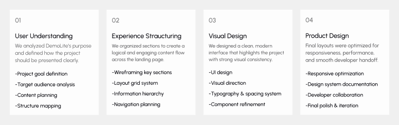
Design Process
Our design process for DemoLite followed a structured Lean UX approach focused on clarity, simplicity, and effective presentation. Every step was aligned with showcasing the project professionally while ensuring smooth user flow and strong visual impact.
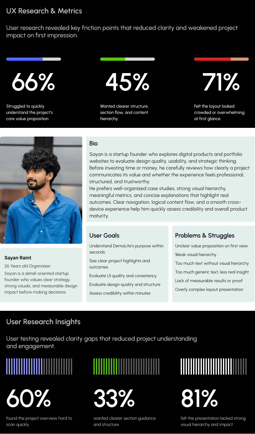
UX Research & Insights
Understanding how users explore DemoLite projects was essential to shaping the platform. We analyzed how visitors browse portfolios, review case studies, scan visuals, and evaluate credibility before making contact or inquiries.
The goal was to identify friction points and transform them into opportunities for clarity, structure, and stronger presentation impact.
Our research showed that users prioritize clear project summaries, structured layouts, visible results, and smooth navigation early in their journey. Based on these insights, we refined content hierarchy, section flow, and visual balance to create a faster, more engaging browsing experience across devices.
Key Research Findings
Users struggled to quickly understand project value at first glance
Many felt overwhelmed by long, unstructured content sections
Project outcomes were not highlighted clearly enough
Navigation between sections lacked clear guidance
Trust signals and key results needed stronger visual emphasis
Visual Identity & Brand Story
The visual identity of DemoLite was crafted to feel modern, minimal, and professional. Clean typography, structured layouts, and balanced spacing highlight clarity, usability, and strong presentation.
Each section was designed to feel simple, organized, and easy to explore—reflecting the project’s goal of clear communication and impactful storytelling.
The result is a cohesive visual system that presents the concept confidently across both desktop and mobile screens.

Design system
The DemoLite design system ensures clarity, consistency, and a strong visual identity. We used DM Sans as the primary typeface for a clean, modern, and highly readable interface. Bold headings create clear hierarchy, medium subheadings guide sections, and balanced body text improves readability across devices.
The color palette reflects warmth and professionalism. Selective Yellow highlights key actions, Fawn White keeps the background soft, Obsidian Black adds strong contrast, and Egg White White maintains visual balance. Consistent spacing and grid structure ensure a cohesive and scalable web experience.

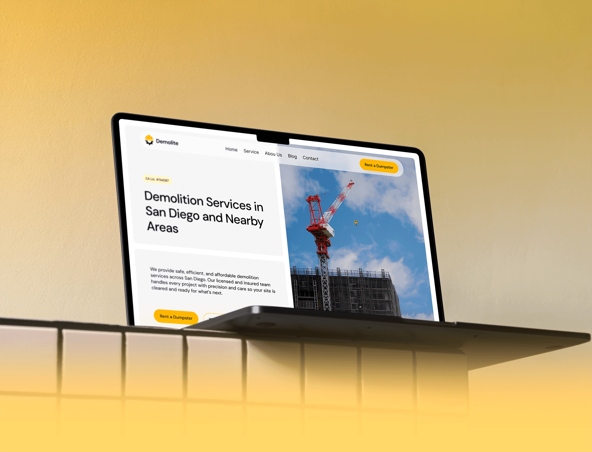
UI Design
The DemoLite UI was designed to feel bold, structured, and professional—reflecting strength and reliability in the demolition industry. A clear visual hierarchy highlights key services, statistics, and call-to-action buttons, helping users quickly understand offerings and take action.
The balanced layout, strong typography, and high-contrast color accents guide attention naturally across sections. Service cards, trust metrics, and project visuals are organized in a clean grid to improve scannability and clarity.
The interface remains fully responsive and consistent across devices, ensuring a smooth browsing experience from desktop to mobile while maintaining brand impact and usability.